Monday, November 15, 2010

Contest Submissions


PDN


Photographer's Forum

River Art: 2010 Susquehanna International Fine Art Competition
National Geographic

Alexandre Singh Artist Lecture Questions/Response

1. Many of your works require the viewer to spend long hours listening or reading. Seeing as how short some peoples' attention spans are, how do you deal with this desire for immediacy? Do you take it into consideration, and can your overall message be summed up in a short time?

2. With your diversity in mediums, what kind of artist would you consider yourself? Your lectures seem highly intellectual and quite long. Are you more of a teacher than an artist and how does your choice of audience effect/reinforce this?


I really enjoyed Singh's lecture/performance. It was unlike any of the others I've seen this year. I was engaged the entire time. Before the lecture, I couldn't really find much on his work. I was anxious to see what it was all about. Although the other work he showed at the end seemed interesting, the live performace, "An Edifice of Association" was just amazing. I loved the fact that there were two projectors and he paced back and forth manually changing the slides. It could have easily been done in Powerpoint, or another similar program, but it showed the two contrasting sides of thinking and association. Singh is a very good public speaker. He kept the audience's interest and interjected humor and sarcasm into parts of the performance. He also mentioned that each show is somewhat customized depending on the location. I thought this was interesting and very smart to make each performance better touch the audience. Lastly, the ending was perfect. All of a sudden, he exclaimed "The End" and cut the power to the projectors, leaving the audience in darkness. It was as if I had awoken from a dream and tried to piece back what had just happened. 

Three Words
Performance
Imaginative
Teaching

His work is so unique, I am really unsure how to categorize it, or which words best describe his style. I like that he isn't limiting himself to one way of presenting his work. My second question is a bit unimportant. I don't really believe that he is too concerned with being a certain kind of artist. He is just doing what he does, and using whichever medium will best convey the message. To answer the first, question, I believe he just engages the audience with his ability to speak. The lecture, for me, went by very quickly. It ended so abruptly, I wanted more. I liked his quote, “Writing is a form of magic.” He definitely shows this to be true in his performance. My favorite quote, though, was “Everything is understandable. Art doesn’t need to be mystified.” He explained that no matter how long it takes, or how many words, things can be explained. I thought this was especially inspiring and important seeing as how some of his art is very lengthy. “The Mark of the Third Stripe” is based off of a 1000 page book. I thought that was incredible. 

Sunday, November 14, 2010

Artist: John Copeland

 EVERYONE WANTS TO BE MY FRIEND    36X25 INCHES     GRAPHITE AND COLORED PENCIL ON PAPER     2010

VICTORY AT SEA     30X22 INCHES     GRAPHITE, COLORED PENCIL AND OIL ON PAPER     2010

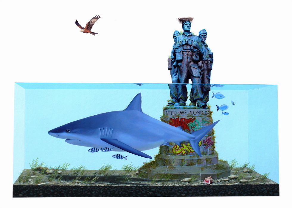
 Seek and destroy      40X48 INCHES     ACRYLIC ON CANVAS     2010

BE A GOOD NEIGHBOR      40X48 INCHES     ACRYLIC ON CANVAS     2010

He Said She Said 56 x 50". ink, gouache, acrylic and graphite on canvas.  2007

"It's all behind you now". 89 x 51". ink, gouache, graphite and collage on paper. 2006

ONWARD AND UPWARD      54 X 60 INCHES      ACRYLIC ON CANVAS       2010

old glory      70X90 INCHES     ACRYLIC ON CANVAS     2010

your heaven looks just like my hell      86X108 INCHES     ACRYLIC ON CANVAS     2010

eyes on the prize      96X84 INCHES     ACRYLIC and oil ON CANVAS     2010

PUT YOUR HAND IN MINE      54X60 INCHES      ACRYLIC ON CANVAS      2010


Artist Bio
“The New York based artist, John Copeland, is known for his large scale paintings and drawings, and on Friday he opens his first solo show in Denmark at V1 gallery. His field of investigation is human existence in terms of the social interactions, negotiations, and conflicts that is part of our everyday life.
Through an imagery of faceless, fleshy figures, skulls, cartoon characters, and animals he displays themes like sex, violence, abuse, power, and joy. This infuses his works with a strong undercurrent of both darkness and raw energy that defies any moral message, but rather mirrors the fight for truth, the lack thereof, and hypocrisy in all its deformities. Kopenhagen have met the artist before the opening to ask him three quick questions about his new works, the disruption between good and bad, and how to visualize the uncertainty of meaning.

John Copeland (f. 1976) was born in California where he also studied at California College of Arts and Crafts. He is part of a younger generation of prolific New York based painters revitalizing the narrative of contemporary painting and has had solo exhibitions at e.g. Galerie de Meerse (The Netherlands), Nicholas Robinson Gallery (NY), 31Grand (NY), and Juice Gallery (San Francisco). Next month V1 Gallery also presents another new solo exhibition by John Copeland at the invitational art fair in New York, Volta Show NY, from March 4th – March 7th. 2010.”
http://www.kopenhagen.dk/index.php?id=20777

Relation to my work
I love the interactions present in Copeland's work and can relate them to my work. Many of his paintings show groups of people interacting in a given space and incorporate the viewer. The content he chooses to show and the way that the information is cropped, really bring the viewer into the scene. In his drawings, I can relate to his play of size and scale. They seem pretty freeform but the end result is very interesting. It keeps my eye moving and trying to piece the scene together. I also really like the keyhole images where your focus is dead center because of the black frame. Lastly, I see similarities conceptually, in that he isn't trying to make some kind of argument and that he is balancing in between. 

Inspirational Quotes
“Protagonists and antagonists. Vessels and metaphors. They are not specific individuals, I work pretty hard to stay away from anything too literal.”

“How we get along or don't, social issues, conflict, how we manage to keep going, this crazy place we live in, are all things that I'm trying to talk about. Trying to laugh, have fun and move ahead with it, let things evolve.”

“In many of them some social interaction happens, negotiating something that could be weird or easy, comfortable or awkward, some exchange in various forms. More specifically I am interested in what goes on under the surface, the physical vs. the psychological, a plurality of motives, intentions, and results. That is something that runs through all of the works.”

“I am also playing with people’s reactions, with the role of the viewer, the act of looking. For example, some works incorporate images from one painting into another, in one painting a crowd of people looks at the image of another painting with disgust or glee, creating both a response and dialogue between the two images.
I am not trying to make any moral argument at all. For me there is a plurality in things and I work very hard to have the works not have a definable or literal substance, I want them to be on the line of decipherability, of legibility. I have always pushed my work to balance on this tittering line.”

Artist Website
http://www.johncopeland.com/default.html

Gallery Representation
http://www.nrgallery.com/index1.php

http://www.v1gallery.com/

Interviews
http://www.fecalface.com/SF/index.php/features-mainmenu-102/473-john-copeland-interview

http://www.kopenhagen.dk/index.php?id=20777

http://1001journals.com/interview/john-copeland

Monday, November 8, 2010

Graduate School Application


The university I chose for the graduate school application is Rochester Institute of Technology. I actually considering applying here for my bachelor degree, but in the end did not. My hometown is very close to Rochester and some of my family still lives around there. I very much miss upstate New York. Their program is usually ranked pretty high for the master of fine arts programs. According to USNews, it was ranked at number three as a tie with Rhode Island School of Design. I am interested in the program because it is “where the arts and technology collide.” Not only do I want to better my understanding of creating conceptual art, but I think it would be a great opportunity to learn new forms of technology to incorporate into the art making process. A more scientific approach to my process would be incredibly interesting. Also much of the work I found from the faculty and current students really furthered my want to attend this university.

Faculty of Interest

MINOR WHITE
Although he was only a professor at RIT from 1956-1964, Minor White is still a big selling point for me. I fell in love with his images early on and still think they are remarkable.
“(born July 9, 1908, Minneapolis, Minn., U.S—died June 24, 1976, Cambridge, Mass.) U.S. photographer and editor. He began to photograph seriously in 1938 when he went to work for the Works Progress Administration. In 1946 he studied with Edward Weston and Alfred Stieglitz before moving to San Francisco, where he worked closely with Ansel Adams. He succeeded Adams as head of the photography department at the California School of Fine Arts and later taught at MIT. He founded and edited (1952–76) the photography magazine Aperture and also edited Image (1953–57). His efforts to extend photography's range of expression made him one of the century's most influential photographers.”
 Barn and Clouds, in the Vicinity of Naples and Dansville, New York, 1955
Peeled Paint, Rochester, 1959

Rochester, 1954
Snow on Garage Door, Rochester, 1960
 No print sizes given.
Taken from http://www.masters-of-photography.com/W/white/white.html
PATTI AMBROGI
I am interested in her incorporation of technology and moving image within her works.

Patti Ambrogi is an Associate Professor of Photography at RIT where she teaches a series of courses that explore the descriptions that surround photography including The Photograph and the Moving Image, Art and Censorship, Art and Principled Positions, and Women and Visual Imaging. She has worked for a number of years on the creation and development of The Media Cafe, where photo students explore these new territories of picture making with time-based media and confront the inherent shifts in meaning and interpretation. Ambrogi has also established a time-based video and sound collection to support this work which is housed in the Wallace Memorial Library. Patti Ambrogi is the recipient of various grants for her artwork and awards including the Eisenhart Award for Outstanding Teaching.”

 Hillary Clinton Campaigns
 Sarah Palin Live from Saturday Night
 Martha
 Thats for Him to Answer...

Images taken from her series Cover Girls.
"The Cover Girls are electronic paintings. They are constructed with interior images and maps in serial structures. Frames of the original media are recaptured and recreated in a set of imaged tiles. The frames are sequenced back into movie clips."


Other Interesting Faculty Work:
Angela Kelly’s Domestic Discomfort
http://angelakellyphoto.com/domesticdiscomfort1.html

Carla William’s “It’s What We’ve Always Called It” and “How To Read Character”
http://carlagirl.net/photowork/?p=4
http://carlagirl.net/photowork/?p=48

Oscar Palacio’s Unfamiliar Territory
http://www.oscarpalacio.net/unfamiliar_territory/unfamiliar_territory.html

Students of Interest

Misha Tulek

“It all begin in 1998. In the summer of that same year, I volunteered with a research team from the Smithsonian Institute to study Katydids in Northeastern Peru. I naively borrowed my little sister’s point-and-shoot camera to document my adventures. Upon my return, I was heartbroken by the results of my photographs. The images I had taken had in no way captured the pure majesty of the jungle I had seen with my own eyes. However, despite the poor quality of these photos, my family and friends still enjoyed the images. Regardless of the images, it was a powerful experience in which I learned the incredible ability of photography to communicate the essence of ideas and places. And so, my initial desires to photograph came from a simple need to better communicate the wonder, beauty, and majesty of life as I experienced it. What seems like a short while ago has turned into nearly a decade of photographic study. If I were to summarize the course of this study, I would have to borrow the words of Ralph Waldo Emerson, who famously wrote in his essay on self-reliance, “the voyage of the best ship is the zig-zag line of a hundred tacks.” Likewise my photographic voyage has been a journey of many tacks. From attending night school in photography, to working at a small town photo store, to long hours pouring over photography books, to religiously attending photo exhibits in museums, to working for respected photographers such as James Nachtwey, to saving every penny to realize my own projects, my course of study has been an organic and unconventional one- a self tailored education, of serendipity, mixed with push, and hard work.
I cannot count the lonely moments, which I have spent looking at photographs in a museum, and everything goes still; it’s just me and the photograph. The image has captured me. And all I need is that moment for the photograph to teach me how to see. What do I learn to see? I learn how to render mercy. I learn how to hope. I learn how to hate, and then forgive. I learn how to be an artist. But most importantly, in learning how to see, I also learn how to communicate-to communicate the wonder, beauty, and majesty of life, even if it’s in a landfill.
The road has been demanding and long. However, on a daily basis I seek to improve my photography, as a means of expression, a tool for peace, and a profession to live by.”


Images taken from his series Phase Three. No Dimensions given.

Other Interesting Student Work

Matt Chung’s Asphalt/Grass
http://art.mattchung.com/#7366/Asphalt-Grass

Emma Powell’s The Impermanence of Life and Light
http://emmapowellphotography.com/

Sunday, November 7, 2010

Artist Ryan McGinley

Alex (Hurricane), 2010 
Tree # 1, 2003 
Untitled (Nude, Sand), 2005 
Untitled (Yellow Sky), 2006 
Blue Breakdown, 2008
No print sizes given.

Bio
RYAN MCGINLEY (b. 1977) lives and works in New York.  He enrolled at Parsons School of Design in 1995, and made a name for himself with ‘The Kids Are Alright’, his raw and intimate photographs of friends in downtown Manhattan at the turn of the millennium.  McGinley’s work has appeared in many publications, including Index, W, Vice, ID, Dazed and Confused, The Fader and New York Times Magazine.  At 24, McGinley became the youngest artist to have a solo show at the Whitney Museum of American Art, and his work has continued to be exhibited internationally, at venues such as P.S.1, Galerie du jour Agnès b., FotografieMuseum Amsterdam (FOAM).  In 2007, McGinley received the prestigious ICP Infinity Young Photographer Award was honored by the Guggenheim Museum’s Young Collectors Council.  McGinley’s latest series, ‘I Know Where the Summer Goes’, was presented by Team Gallery in May, - a monograph of his work, Ryan McGinley, will be published by Twin Palms in Autumn 2008.
http://www.seesawmagazine.com/mcginleypages/mcginleyinterview.html

Relation to my work
McGinley’s work features nudes in nature, just as my images. I really enjoy his series Moonmilk. The figures are very tiny in these huge caves. It forces the viewer to stay longer and search for the figure. His use of color in this series also helps camouflage the bodies. All of his images give off strong feelings, whether they are excitement, tranquility, or wonder. I want to place myself into the images. I am really interested in his use of nudes. Through his series, nudity becomes less shocking and more natural. You become accustomed to seeing nude bodies and realize that it isn’t anything we should be afraid to look at. I have worked with this idea in my previous and current work.

Inspirational Quotes
“I’m not making documentary photographs anymore, but I’m still interested in positive energy, freedom and rebellion.”

“When you’re naked you can’t hide anything, and you become very close with people incredibly quickly.  It was amazing, and I started to think about what kind of images I really wanted to make.  I started to have a different approach.”

“Well, if you take the everyday things that people do in nudism, vintage pornography, and Sports Illustrated, and you mix them all together, you’ll get an idea of what my photos look like.”

“I always wanted to take risks and to have that sort of uncomfortable feeling of not knowing what to expect. I like to make mistakes and learn from them. I think my work evolves from making mistakes doing new things. If you’re not making mistakes you’re not doing anything, you know?”


Artist Site
http://www.ryanmcginley.com/

Gallery Representation
http://www.teamgal.com/

Interviews
http://dossierjournal.com/blog/features/ryan-mcginley-in-conversation-with-david-strettell/

http://www.believermag.com/issues/200802/?read=interview_mcginley

http://www.seesawmagazine.com/mcginleypages/mcginleyinterview.html


Midterm Critique Response


Although I was at first very against watching my own critique, it is a good exercise to get the most out of it. I am usually pretty nervous before critiques and sometimes in the rush, I sort of black out and don’t remember what happened. But, with this tape I can look back and dissect every comment I wouldn’t normally remember. When I was presenting, it all went by so fast. I wish it had lasted longer. I think that with only twenty minutes to see a new body of work, it can be very hard to provide in depth feedback, but I think that everyone did a good job and were very helpful. As far as myself, I think I have much room for improvement. I don’t think of myself as a good presenter and public speaking is pretty frightening even when it’s a room full of people I know. I’ve gotten better over the years but still need work. I need to speak more clearly and louder. I need to not move around or pace as much. I tend to fidget. Although, I am very excited about my work and about what others have to say, I think my nerves make me appear less excited. All of this can be better but I think the only way is by repetition. I just need to do this many times so it becomes familiar.
As far as my work, I need to be very careful with the presentation. With all the black in the images, every tiny little scratch, smudge, and dust speck are more obvious. Tom mentioned that from where he was sitting he could see a fingerprint on a 20x30 and that he wanted to make it into an island or other object. While I like that he longed for it to be something in the void, I don’t want this to come from an imperfection in my printing. I want it to be directly from imagination or memory. Also there were a few prints where the quality and brightness were off. I decided to present them for this working critique just as a reference to size, but I know that I need to nail the technical printing aspects for other critiques.
Lastly, I wanted my artist statement to be very concise. I didn’t want to give away every minor detail to the work nor did I want to sound preachy. There were parts of the series that left people feeling unsure and they were looking for the reasons why. Since this was a working critique I explained some of the elements they had questions with. I am still trying to figure out how much I should include into my artist statement without giving it all away and leaving the audience with nothing to figure out on their own. 

Monday, November 1, 2010

Zoe Beloff Lecture Questions/Response

In the piece The Adventures of a Dreamer by Albert Glass, you use Albert Glass's sketchbook of a Freudian theme park. How true did you stay to his sketches? Is your hand/idea present at all in the installation? Would you like it to be?


Many of your pieces deal with the subconscious, such as History of a Fixed Idea and a Modern Case of Possession. Where does this play of subconscious, originate? Are these thoughts that you've experienced, or taken from some of the cases you've studied?


Response


For most of the lecture I felt as though I was in a history class. Beloff kept bringing up images and work from “other people.” I was very interested to see her work instead of her references and influences. Then at the very end, a question was asked and she answered, “I am Albert Glass.” This was the most important part of the lecture. It was like sitting through a movie then being blown away by the very last scene. This quote made the work. It makes me wonder how I, and others would feel if she had not revealed this essential piece of information. There has to be instances where an opportunity to reveal the truth doesn’t present itself and the audience/viewers are unaware. Does this frustrate her? Is she aching to tell people the truth?
Before the lecture, I had no idea that this woman is actually multiple people. She is not only an artist but also an actor. Except she has to always be in character(s). This has to be stressful physically and mentally. It also makes me wonder if the lines of herself and her characters are blurring and she is losing herself. The commitment to her work is pretty amazing.

Three Words
Imagination
Identity
Philosophy


Taken from The New York Times. Photo by Brad Paris


The piece that I found to be the most interesting is Dreamland. Not only is Beloff creating artwork, but she’s also creating a new world with a new history. She does it well. The audience is fooled and our minds entered by her world and her words. She controls the audience. Without her revealing that she is Albert Glass at the end, I honestly don’t think I would be interested in this work. Now that I know, I want to go back and look at her work again. The lecture was more of an experience. There was audience participation, but it all took place in our minds. I would really like to see her work in a gallery and the feeling it gives off.

As explained above, my first question was answered. Its funny to see how fooled I was with this question. The second question I am still unsure about. I don’t know how much of her work is her doing. Now, I wonder if the case studies were real and if the found footage was actually found. I am also unsure if she designates some thoughts/dreams as her own and some for Albert Glass. How does she separate the two? I guess I’m still pretty blown away and this confusion I’m experiencing only makes me more interested in the work. 

Wednesday, October 27, 2010

Idea: Posture


I have been looking at the stance of my models and I, and how simple movements can make a large impact. In my first images, I wanted the models to be rigid with their feet together and their free arms to be at their sides. This helped give the entranced feeling and ritualistic look. When I shot the images where I was standing in the water, it was late, I was tired, and the bottom was soft and unstable. Tom could tell that I was tired from my body language and said it added to the picture. He suggested I look at Greek sculpture.

Key Quotes:

“The point is that for every situation there must be two elements to body language, the delivery of the message and the reception of the message.”
Julius Fast
http://www.docstoc.com/docs/126391/Body-Language---JULIUS-FAST

“Introspective and expressive body awareness are both faculties of their own, varying among individuals like any other talents, but, at the same time, they tend to go together.”
Cecilia Ryding
http://web.ebscohost.com.proxy.library.vcu.edu/ehost/pdfviewer/pdfviewer?vid=2&hid=11&sid=902f8066-9cb2-4265-a29a-932699cfd484%40sessionmgr4

“Body movement is seen as interdependent with linguistics, and with, tactile, olfactory, gustatory, and proprioceptive systems. Each of these senses receives information, and puts it in context. The matter is complicated by two factors: the context in which channeled information is put is also generated by the very information received- living is feedback and cross-referencing.”
Richard Schechner
http://www.jstor.org.proxy.library.vcu.edu/stable/1144846?seq=4&Search=yes&term=kinesics&list=hide&searchUri=%2Faction%2FdoBasicSearch%3FQuery%3Dkinesics%26gw%3Djtx%26acc%3Don%26prq%3Dbody%2Blanguage%2BAND%2Bart%26hp%3D25%26wc%3Don&item=1&ttl=938&returnArticleService=showFullText&resultsServiceName=null

Annotated Bibliography

Hallett, C.H. “The Origins of the Classical Style in Sculpture.”   Journal of Hellenic
            Studies, 1986. Pages 71-84. JStor. Web. 27 Oct. 2010. <http://www.jstor.org.proxy.library.vcu.edu/stable/629643?seq=1&Search=yes&term=kouros&term=contrapposto&list=hide&searchUri=%2Faction%2FdoBasicSearch%3FQuery%3Dcontrapposto%2BAND%2Bkouros%26gw%3Djtx%26acc%3Don%26prq%3Dcontrapposto%26hp%3D25%26wc%3Don&item=5&ttl=19&returnArticleService=showFullText&resultsServiceName=null>

This article provides a brief summary on classical sculpture. I focused on the element of posture while reading it. Kouros is a term meaning male youth. This style of sculpture was popular during the Archaic period in Greece. These sculptures had a very rigid pose. The figures stood straight up with their feet together and hands at their sides. They referenced the god Apollo and according to some, were meant to represent mankind rather than a specific male. Their eyes are straightforward and their expression is quite blank. This stance seemed unrealistic and later “contrapposto” evolved. These figures had one leg, the engaged leg, carrying the weight of the sculpture and a free leg, which was bent. It was much more natural looking than kouros. The body doesn’t look so mechanical and stiff. It also provides tension, as the figure is shifting weight from one leg to another.


http://www.mlahanas.de/Greeks/Arts/Kouros/VolomandraKouros.jpg


http://surveryofart.blogspot.com/2009_10_01_archive.html


Sunday, October 24, 2010

Artist: Lucas Soi

After The Dance (2010) Pen & Ink 14" x 34"

Black Mass (2009) Pen & Ink 14" x 51"

Deep End (2009) Pen & Ink 14" x 51"

Glass House (2009) Pen & Ink 14" x 34"

The Witches (2009) Pen & Ink 14" x 51

Bio:
Lucas Soi is a Canadian artist living and working in Vancouver, B.C. His work focuses
on how the consequences of our actions in the past relate to the circumstances in which we find ourselves today.

Relation to Work:
While I couldn’t find too much on Soi, I found his work to be very refreshing to look at. I love the simple use of pen and ink, the repetition of dots, and the environments chosen. I also like the panoramic format, which I think adds to the strangeness. His style suggests cartoons or coloring books, yet the messages are very dark. I like his use of abrasive imagery and that he doesn’t feel the need to censor himself. These drawings give us a voyeuristic peek into odd rituals.

Inspirational Quotes:
“I think being young, you're closer to conception than to existence. Meaning you're really closer to death than life. If you're fourteen years old, surrounded by your parents who are, say, triple you’re age, you're closer to "just being born" than to "everyday life". So destruction, which is a kind of creation in reverse, is closer to your understanding, maybe?”

“So maybe the darkness that you see in these drawings is just the connection all youths have to that unknown place where we come from, and where we go when we die.”

“I wanted to reflect where we’re at in our culture right now, but show that we've always been here. We haven't changed that much. Ancient myths are really eternal truths, you know?”

Artist Site:
http://www.lucassoi.ca/

Interview:
http://www.fecalface.com/SF/index.php/features-mainmenu-102/2253-lucas-soi-interview

Gallery Representation:
http://www.shootinggallerysf.com/

Sunday, October 17, 2010

Artist: Josh Keyes

Entangle II, 30"x40", acrylic on panel, 2009 
Entangle I, 30"x40", acrylic on panel, 2009 
Island, 30"x40", acrylic on panel, 2009 
Lifted, 2009, 40"x30", acrylic on panel
Roar I, 18"x24", acrylic on panel, 2009

Bio:
Josh Keyes was born in Tacoma, Washington. He received a BFA in 1992 from the School of the Art Institute of Chicago and an MFA in 1998 from Yale. Eighteenth-century aesthetics and philosophies, particularly those of the Neoclassical and Romantic movements, shape his work. Keyes is drawn to the clinical and often cold vocabulary of scientific textbook illustrations, which express the empirical "truth" of the world and natural phenomena. He infuses into a rational stage set many references to contemporary events along with images and themes from his personal mythology and experience. These elements come together in an unsettling vision, one that speaks to the hope, fear, and anxiety of our time. Keyes currently lives and works in Portland Oregon with his wife, graphic designer Lisa Ericson.
http://www.joshkeyes.net/biography.htm

Relation to my work:
This work is quite similar to Ryan McClennan’s, which I posted before. This work shows more of an interaction between humans, animals, and habitat. The paintings are quite simple but present a lot. I love the uneasiness, and sometimes violence, paired with the quiet beauty. The interaction that he portrays is both disturbing and beautiful. They are playful and dangerous.  The compositions and small details keep my eyes moving around and around the images. Lastly, I like his repetition of the characters and how each they often represent people in his life.

Inspirational Quotes:
“I have always enjoyed the use of personification in the work of artists. It is a way of stepping outside human perception, in doing so it calls attention to the human condition without depicting a human figure.”

“I am developing a cast of characters in my work to inhabit the fragmented landscape. The animals have a personal meaning for me. They often stand for people or events in my life.”

“The diagrammatic quality of my work refers to the human gaze, similar to the idea of the male gaze, it sees and takes in only what it wants to see or desires to see. The model I am using is the scientific gaze or perception. Things seen in quantity separate from the whole. A laboratory where animals, ecosystems, humans, are reduced to objects.”

“Though I am tempted at times to fill the entire space, I find that the minimal stage set helps to focus the attention on the narrative. I also use the minimal and segmented landscapes to bring clarity to a very complex word of events. It is a way of quieting down information.”

“Night Painter, like old Philip Guston, quiet, moon, dream time. I have tried working at the crack of dawn but the sounds of the world are distracting. I feel alert and intense when the sun goes down.”


Artist Site:
http://www.joshkeyes.net/

Gallery Representation:
http://www.davidbsmithgallery.com/
http://www.jonathanlevinegallery.com/

Interviews:
http://www.fecalface.com/SF/index.php?option=com_content&task=view&id=385&Itemid=92

http://www.thebrilliance.com/thebrilliance/interviews/joshkeyes/interview.asp

http://theeastsider.wordpress.com/2007/12/07/josh-keyes-interview/

Thursday, October 14, 2010

Idea: Minimalism


I have always loved and tried producing photographs with minimal qualities. Negative space has always been fun to work with as well as limited palettes. Lately, my work is becoming even more minimal and I’m trying to figure out the right amount to include in an image. Too much and there’s unimportant information getting in the way, and too little means the message doesn’t get across. I’m looking for the perfect balance.

Key Quotes
“The organization of the pictorial elements is a challenge. Trying to fill the space without actually filling it. I like to orchestrate the angles and visual elements so that the viewer's eye moves continuously through the work.”
Artist Josh Keyes
http://www.fecalface.com/SF/index.php?option=com_content&task=view&id=385&Itemid=92

“Minimal art is not a negation of past art, or a nihilistic gesture. Indeed, it must be understood that by not doing something one can instead make a fully affirmative gesture, that the minimal artist is engaged in an appraisal of the past and present, and that he frequently finds present aesthetic and sociological behavior both hypocritical and empty.”
Gregory Battcock
http://books.google.com/books?hl=en&lr=&id=lhMS8Ii73ZkC&oi=fnd&pg=PR14&dq=minimalist+art&ots=NcjivOu-FL&sig=sjQnb5Ihd5W0FFZx83ZMzIE2ecI#v=onepage&q=minimalist%20art&f=false

“The death of minimalism is announced periodically, which may be the surest testimonial to its staying power. The term itself, now common currency, appeared in the mid-sixties but was largely unheard outside of art and avant-garde music circles until the eighties, and no one seems certain how to define it even now.”
Edward Strickland
http://books.google.com/books?hl=en&lr=&id=I0F13e62idIC&oi=fnd&pg=PA56&dq=minimalist+art&ots=FHTSeHi8nn&sig=7bTNcVOwBCnf8Fdce8WiDI50Zxo#v=onepage&q=minimalist%20art&f=false
---
Meyer, James. “Minimalism: Art and Polemics in the Sixties.”  Yale University Press.
2001. Google Scholar. Web. 13 Sept. 2010.  <http://books.google.com/books?hl=en&lr=&id=x3EYlwvRzvwC&oi=fnd&pg=PP11&dq=minimalist+art&ots=ofdh8CtWna&sig=LQ1d5Wf5NPGUhtrQ_SINVoLknvg#v=onepage&q=minimalist%20art&f=false>

This article provides a nice overview of minimalism. Meyer says that, “Minimalism is best understood not as a coherent movement but as a practical field.” Minimalism describes various forms of art and design, where the work is stripped down to its most fundamental features.  It is associated with the late 1960s and early 1970s.  It resisted interpretation and was so bare that many people thought it needed more content and complexity.  Some didn’t even consider it art.
Sol Lewitt states, “Recently there has been much written about minimal art, but I have not discovered anyone who admits to doing this kind of thing. There are other art forms around called primary structures, reductive, rejective, cool, and mini-art. No artist I know will own up to any of these either. Therefore I conclude that it is part of a secret language that art critics use when communicating with each other through the medium of art magazines.”

Mondrian.Composition with Yellow, Blue, and Red, 1937-42, oil on canvas, 72.5 x 69 cm
Laszlo Moholy-Nagy. Name ist Hase- ich weiss von nichts (Rabbit is my Name, and I know about Nothing), 1927, Silver print,  8.4 x 6.6 inches
http://www.artnet.com/artwork/424884626/140972/mein-name-ist-hase--ich-weiss-von-nichts-rabbit-is-my-name-and-i-know-about-nothing.html

Laszlo Moholy-Nagy - The Olly and Dolly Sisters, 1925
http://iamallface.tumblr.com/post/61216327/laszlo-moholy-nagy-the-olly-and-dolly-sisters

Mino Argentino. Oil, Acrylic and Gesso, Grids, Pencil Lines 50" x 50"
http://www.askart.com/askart/artist.aspx?artist=11085918